


So there’s this thing going around…. It’s called…websites that are terrible. Now, listen, there is no shame. Really, we’ve all had horrible website at one time or another. But I just think it’s time to really lay out some things, to get the pink elephant out in the open… your website might be terrible IF you do ANY of the following…..
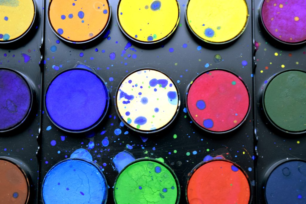
1.) YOU USE EVERY SINGLE COLOR IN THE RAINBOW ON EVERY PAGE.
It legit looks like Corel paint threw up on your site though. Why? Why are you doing this? There is no need to have every sentence on the page in a different color. This is not the Smurfs movie this is your website. Stop it.
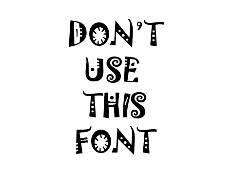
2.) Your fonts are terrible and there are 39 of them represented on each page.
Stop way over fonting. You don’t need all of those fonts, and every time you use a font too many, a baby rainbow unicorn dies. Use 2-3 fonts MAX. MAX. Step away from the font book and no baby magical creatures will die.

3.) Your content so confusing.
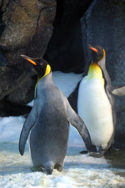
What are you selling? I have no idea. Do you know because it doesn’t seem like it? Not sure why there is a picture of a plate of spaghetti on your home page next to a penguin. Your company is called Clear Tides of Spectacular New Heights Nostalgia and your url is www.OnPurposeFridaysWithKingdomHighFivesAndNewCrestsMountains.com. What does it all mean? WHAT ARE YOU SAYING? I have no idea… STOP IT.
4.) Your website is hard to navigate.
All of your buttons are named weird things. ALL OF THEM. Your photos are under a tab called “Moments taken but never lost captured in the mind of a warrior.” —>Pictures. NAME THE BUTTON “PICTURES.” I should not need a team of Great Escape Room champions to help figure out that the information section is under “the things that remain unsolved in the sights of those who remain unfollowed.”Also, your contact tab (“see the ones who are majestic and called upon”) is completely unlinked. UNLINKED. STOP IT.
5.) Your logo and website don’t look like they belong together.
They don’t look happy together. At all. Was it an arranged marriage? You have a backpacking dog in the middle of the ocean logo with a chic teal (rainbow?) modern color scheme. I have no idea what’s happening. Why is there a dog with a backpack in the first place? But you are selling wrist bands for media companies? I can’t. Stop. Let the dog go, ok? He didn’t hurt anybody but you did, baby unicorn killer…
So if you or one of your friends suffer from terrible websites, let them know there is HELP. PLEASEFORTHELOVEOFALLTHATISPUREANDHOLY stop the madness…
Cheers!
Julie (website hugger)


PLEASE COMMENT BELOW